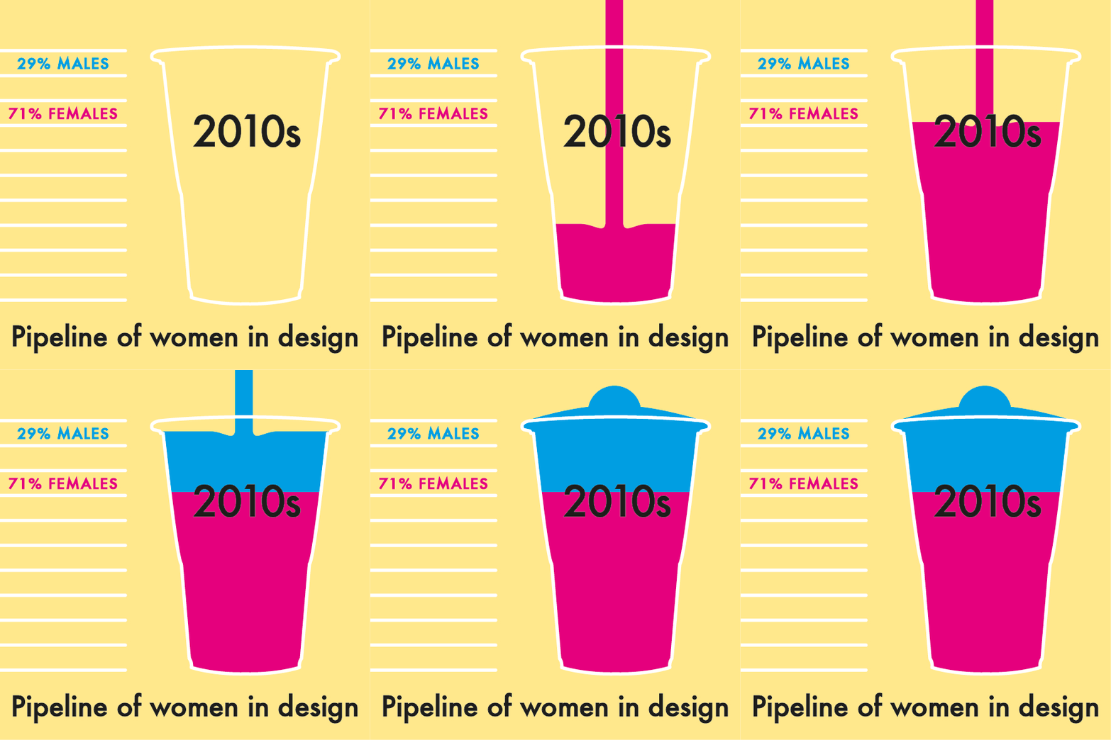
The gendered pipeline of graduates emerging from graphic design qualifications, in Australia, has become a playful data visualisation where the statistics have been poured as brightly coloured slushies.
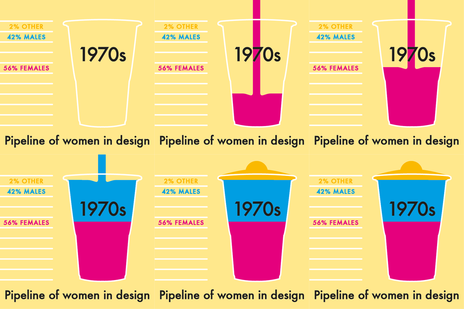
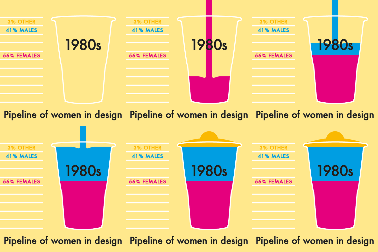
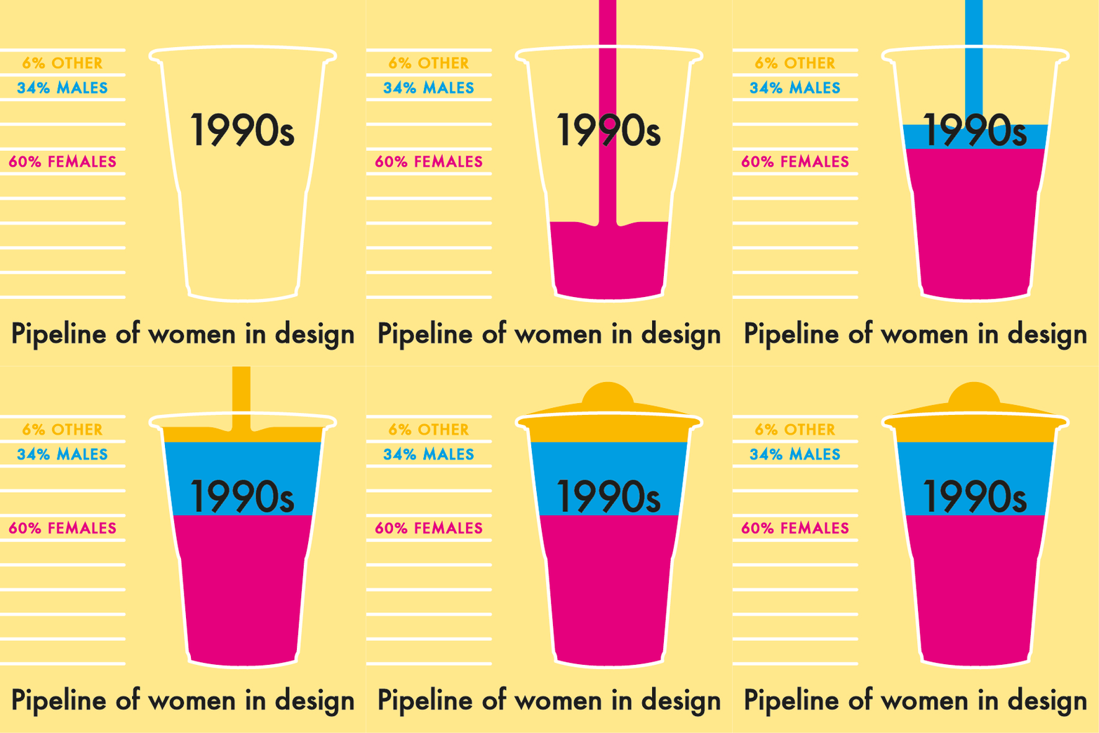
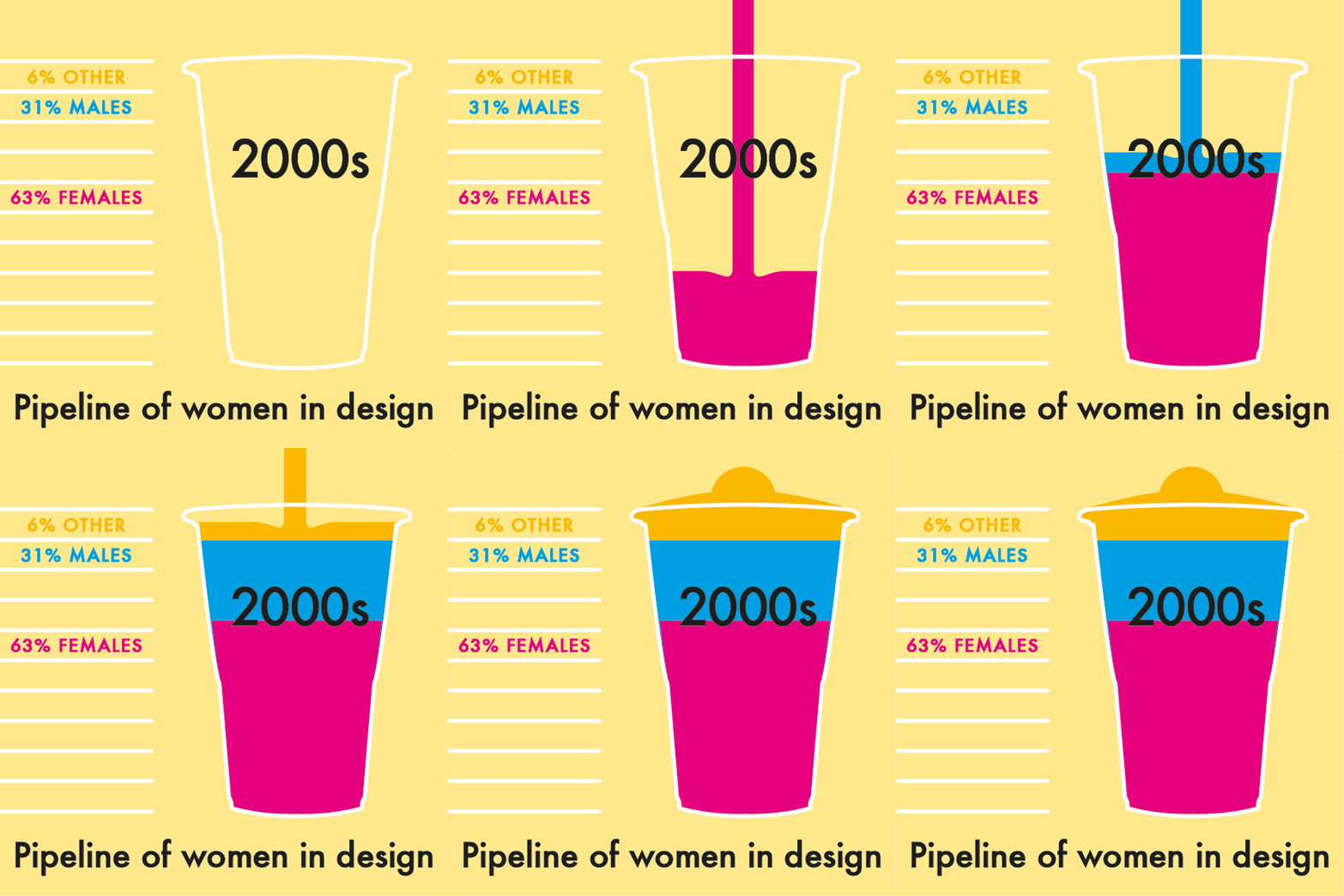
Collating data from Monash University since 1970, each decade of graduates has been broken down into a slushie recipe. Percentages of women are shown as a raspberry flavour, percentages of men are shown as a blue lagoon flavour while unknown and other genders are shown as a yellow pineapple flavour. Pouring each of the five decades offers the opportunity to play with the data and contemplate what the resulting gender mix means to the experience of women as they enter the workforce.
The final slushies reveal a consistent pattern where women make up the majority of design graduates. The percentages of female design graduates are shown to be steadily increasing – beginning with an average of 56% in the 1970s to an average of 71% in the decade beginning with 2010. Below you can see animated gifs that visualise each of these decades as slushies, which are free to download and share on social media.
This visualisation explores the fallacy that such a significant female pipeline should ensure an equitable workplace and challenges the design industry to contemplate how this pipeline has impacted equitable career opportunities, hiring practices and studio environments. The comparison of each decade aims to ignite conversations and thoughts on the data so that you can begin commenting on the visibility of women in Australian graphic design.
